ShopDreamUp AI ArtDreamUp
Deviation Actions


Suggested Deviants


Suggested Collections


You Might Like…


Description
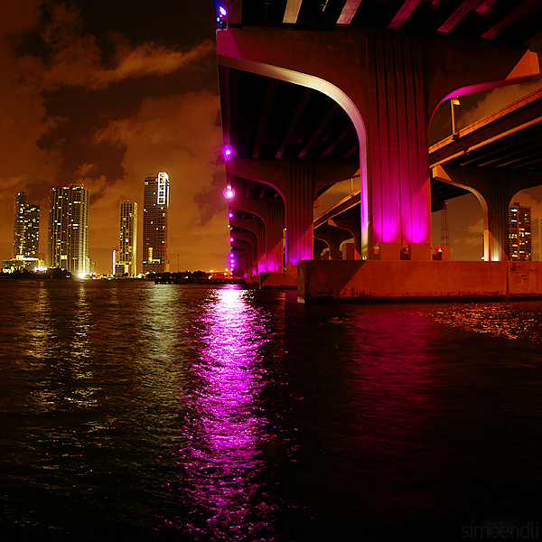
The MacArthur Causeway is the link between Miami and Miami Beach.  (Smile)")
© Simone Zwahlen. 2009
You are not allowed to use my art without my written permission.
© Simone Zwahlen. 2009
You are not allowed to use my art without my written permission.
Image size
600x600px 444.85 KB
Make
SONY
Model
DSLR-A100
Shutter Speed
13/10 second
Aperture
F/2.8
Focal Length
16 mm
ISO Speed
100
Date Taken
Aug 18, 2009, 1:45:14 AM
© 2009 - 2024 simoendli
Comments58
Join the community to add your comment. Already a deviant? Log In
It's gorgeous <img src="e.deviantart.net/emoticons/s/s…" width="15" height="15" alt="
There are several aspects of this I really enjoy:
- the colors of the lights: even though the pink is the brightest, what makes me happy is the orange of the sky and the bridge; it work very well with the idea of a night scene;
- the juxtaposition of geometrical elements makes this very engaging: the horizontal of the water, the diagonals of the bridge, the verticals of the buildings and the reflections;
- the existence of the bridge so close to the viewer makes the perception of space across the water to the buildings that much more real, feasible;
- the angle overall, is very good - I always like seeing the expansion of bridges from beneath them - but such calm and clarity is not always achieved; perhaps night time makes the place seem cleaner too, than it potentially is...
There are also some aspects of this that could be worked on to make the photograph more engaging:
- the choice of crop: I feel like square, with the intersection of all the elements in the center is a bit too basic; the composition has the potential to really move the audience's eye throughout the work again and again. As of right now, it is too stable.
- I keep wishing you would limit the amount of water seen: the closest part of it to the audience is so dark it distracts and overpowers some of the other lighter, but more active elements; for example, the right most part of the bridge, with those separate lanes, is not easily noticed specifically because it is so light in comparison to the water (and I feel that if that part of the bridge was more pronounced, it would balance the photograph better somehow).
- in terms of cropping, I see two potential solutions: one, to narrow horizontally, so most of the focus is taken by the current upper half of the photo; two, to somehow expand vertically, so we see more of the sky and a greater length of the bridge... Either way, I feel like the lower 1/3 of the water should go.
So, yeah <img src="e.deviantart.net/emoticons/s/s…" width="15" height="15" alt="